Navigating DEC's Real Time AQI Page
DEC transitioned to a new data acquisition system and developed a new AQI website to present the data to the public. This page is a guide on how to navigate the new AQI website.
- What do the numbers and colors mean on the map?
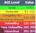 The numbers and colors shown on the site icons correspond to the PM2.5 AQI value, calculated using EPA's NowCast method. There is a legend on the map that explains what AQI ranges apply to the various color codes.
- How do I navigate the map?
 The map is reactive to click and drag, scrolling in and out with the mouse wheel, and the zoom in and out toggles on the map.
- How do I choose what to see on the map?
- A dropdown menu at the top of the map allows the user to only show particular regions or parameters.
- Can I download air quality data?
- Below the map are ready-to-download reports for the regions in Alaska, including Interior, Southeast, and Southcentral. There are various options for export and data display the user can change.
- Where is the rest of the data?
- I want to see more than the AQI value. Click on the site's icon on the map. You can then see the site's page with information including the site photo, coordinates, list of all monitored pollutants with current concentrations, and recent AQI value.
- How can I see past data?
- After you are on the site page (click site icon from the map), you can click the 'Historical Data Concentration' hyperlink. You will see time series plots of the analytes listed in alphabetical order.
- Can I see all the sites' AQIs at the same time?
- On the top border of the map, there is a hyperlink to "See tabular version of this AQI map data"
 Indicates an external site.